Crafting a tactile brand world
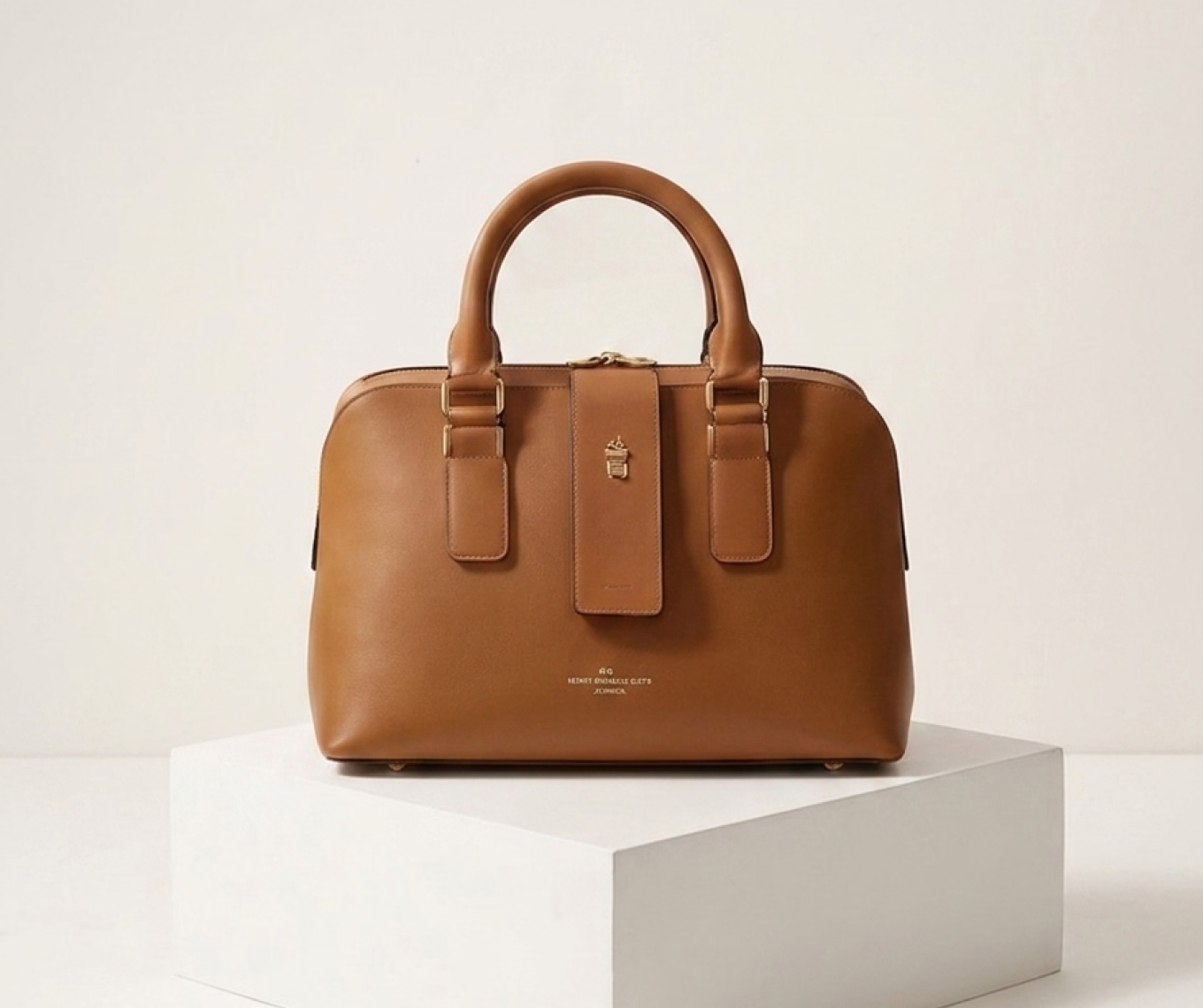
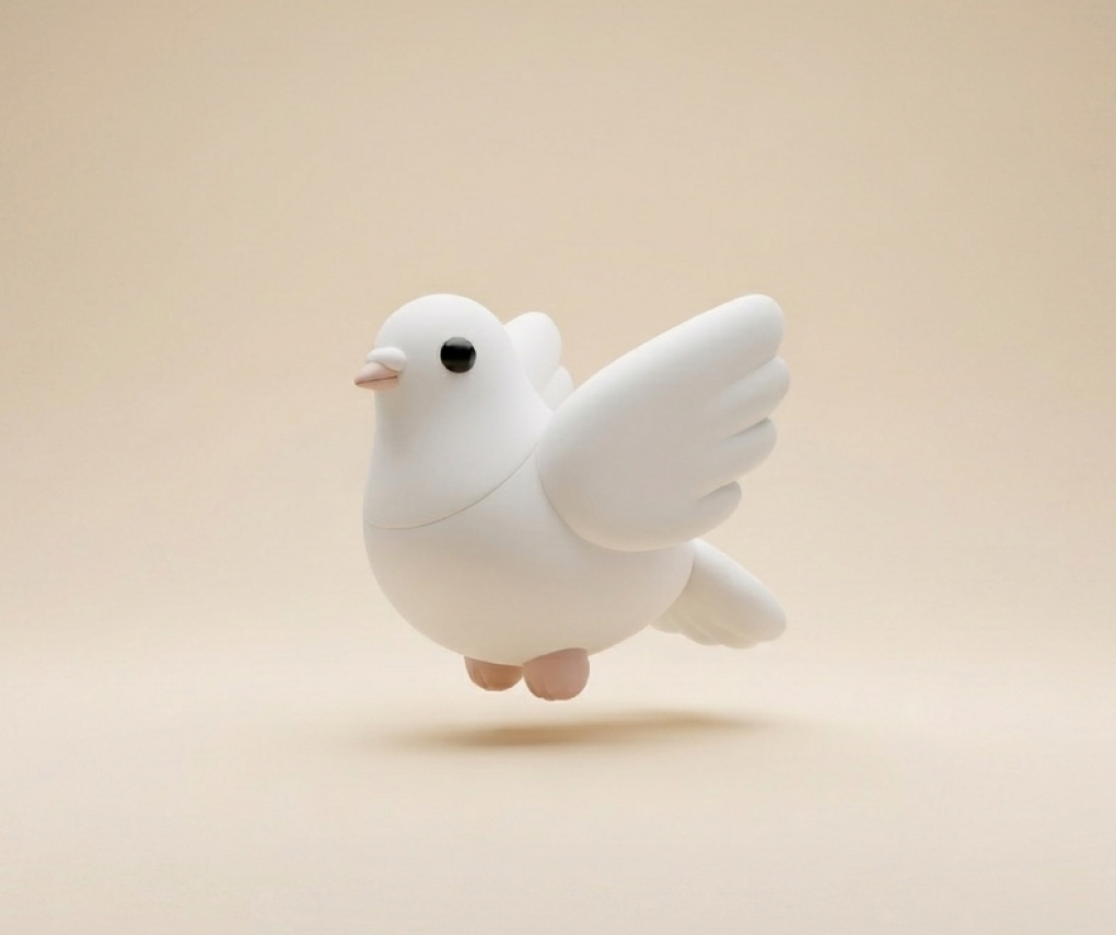
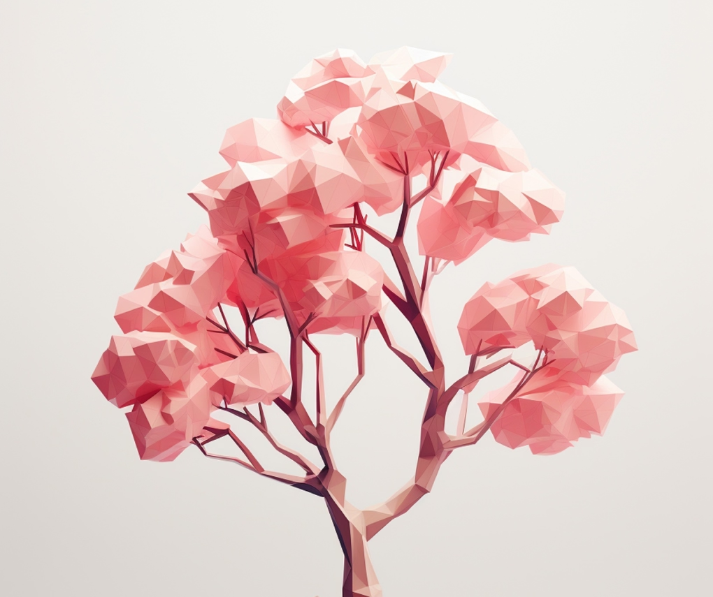
A boutique stationery label wanted packaging that felt as handmade as the products inside. We built a paper-art illustration system that could flex across boxes, labels, and social content without losing its handcrafted charm.
A flat identity in a physical category
The brand's existing visuals were generic stock photography that undersold the craftsmanship of the product. Customers couldn't tell the brand apart from mass-produced competitors on the same shelf.
Challenge points
- Generic photography that hid the handmade quality
- No consistent illustration style across packaging
- Weak shelf presence next to larger competitors
- Social content that didn't reflect the brand's craft story
Illustration-led, not photo-led
We prototyped a paper-cut illustration language early and tested it directly on packaging mockups, letting the physical material guide the direction instead of designing on screen first.
Process
- Step 01 - Explore ( Testing paper-cut and layered illustration styles. )
- Step 02 - Refine ( Narrowing to one adaptable illustration system. )
- Step 03 - Apply ( Rolling the system across packaging and labels. )
- Step 04 - Extend ( Building templates for ongoing social content. )
A shelf presence that stands out
The new paper-art system gave the brand an instantly recognisable look that customers now associate directly with the product's handmade quality.
Results
- 31% Increase In Repeat Purchases
- 2x Social Engagement On Product Posts
- 19% Uplift In Shelf Conversion
- 4x Faster Packaging Turnaround