

Project Overview
Repositioning a brand for a premium market
A wellness brand had outgrown its early identity and needed a rebrand that matched its move into premium retail. We rebuilt the visual system from the ground up around a calmer, more confident brand voice.
The Challenge
An identity stuck in an early stage
The existing branding read as a startup, not the premium retailer the business had become. Buyers at higher-end stockists hesitated to carry the product because the packaging didn't match the price point.
Challenge points
- Visual identity that undersold the product's quality
- Packaging that didn't fit premium retail shelves
- Inconsistent brand voice across web and packaging
- Low buyer confidence from premium stockists
Our Approach
Confidence through restraint
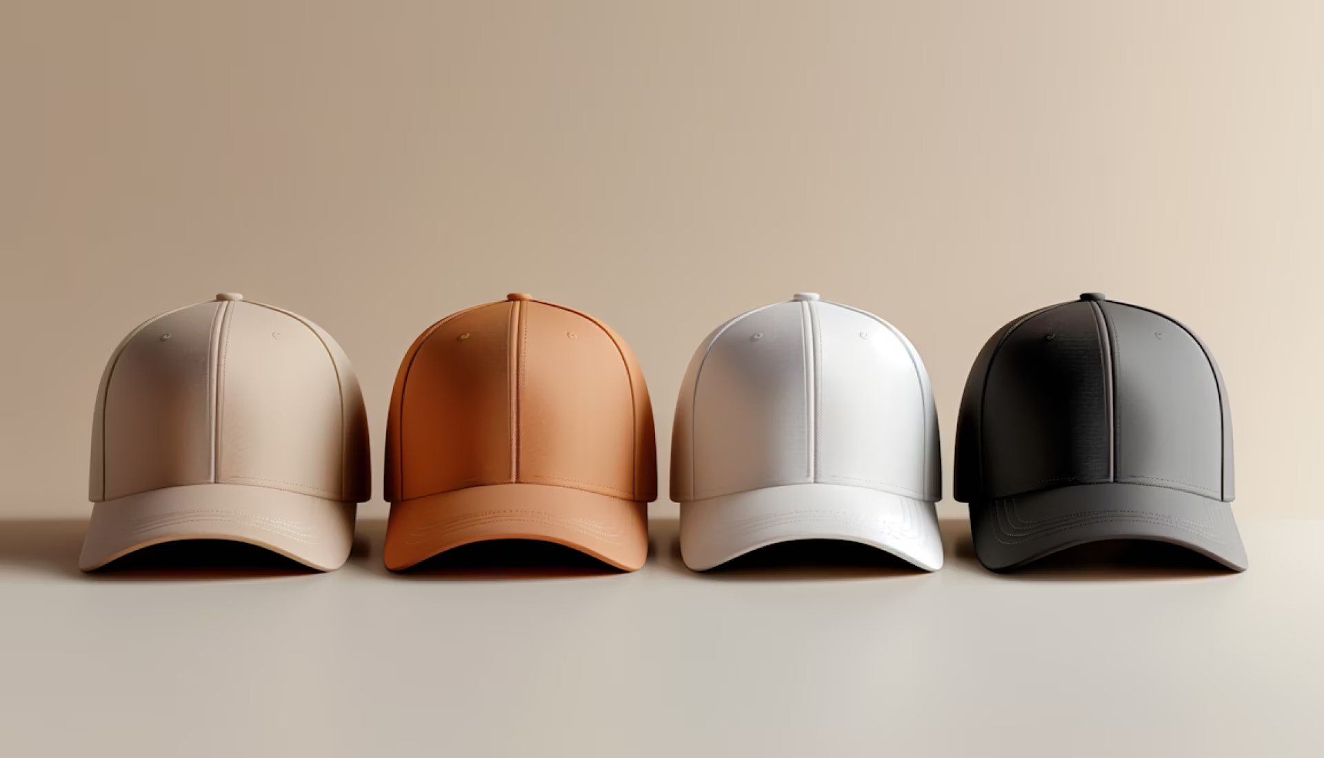
We stripped the identity back to a smaller, more deliberate colour and type system, letting the product itself carry more visual weight instead of competing with busy packaging.
Process
- Step 01 - Audit ( Reviewing the existing identity against the market. )
- Step 02 - Reposition ( Defining the new premium brand territory. )
- Step 03 - Design ( Building the refined visual system. )
- Step 04 - Roll out ( Applying the system across packaging and retail. )
Results
A brand premium retailers trust
The rebrand unlocked new premium retail partnerships and gave the product a shelf presence that finally matched its price point.
Results
- 3 New Premium Retail Partnerships
- 38% Increase In Average Order Value
- 26% Higher Repeat Purchase Rate
- 2x Faster Buyer Sign-off On New SKUs



featured work